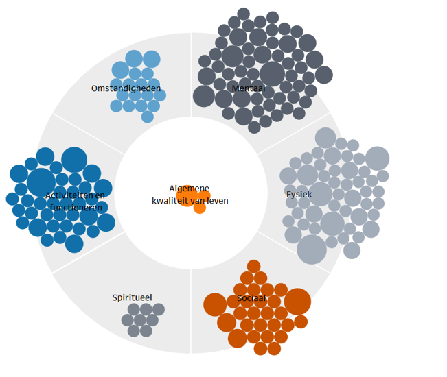
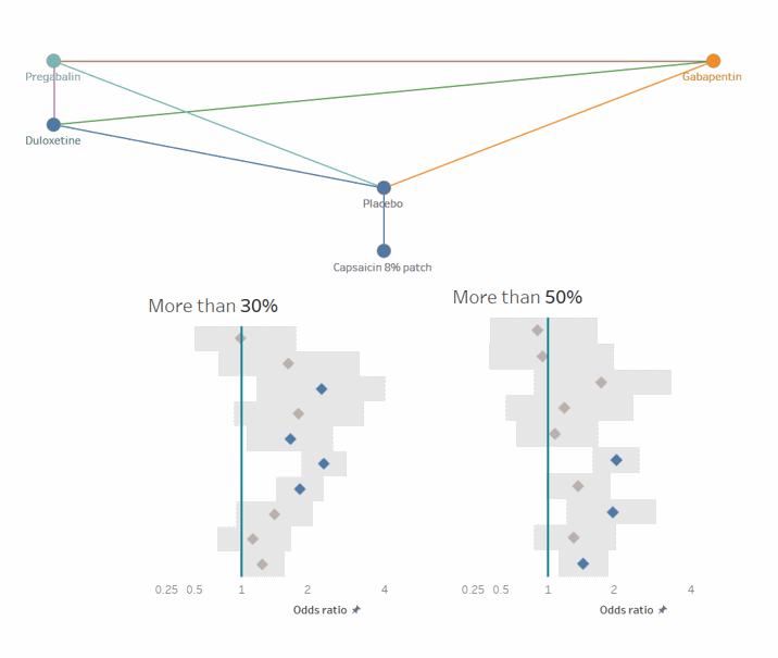
An information visualization presents information —often numbers— in the form of visuals. These visualizations are often interactive, meaning the viewer can click through the visualization to filter data, zoom in, or display additional information. A visualization that brings together different types of data on a single screen is often called a dashboard.
Visualizations are particularly useful for consistently displaying changing information, like monthly financial reports, membership growth, or the impact of marketing activities.
Visualizations are also a great way to present your data online—especially when you want to share research results with a wider audience, or as an interactive supplement to a report.
For these types of visualizations, I enjoy working with Tableau or Power BI. These software tools connect to a wide range of data sources. The dashboard can be published online, or shared with you as a file for your local software.
The data source remains under your control, giving you full flexibility to make changes. In some cases, updating the data can even be automated—especially if the data comes from another cloud-based system (such as online accounting software, membership management systems, webshops, etc.).
You can restrict access to your online visualization for internal use or authorized users only. But you can also make the dashboard publicly available—even embedded within a frame on your own website.
I tailor the visual style of the dashboard to match your organization’s branding or the website where it will be published, so the visualization fits seamlessly with your other communications. When the underlying data changes, all you need to do is update the data source. Your website will refresh automatically.