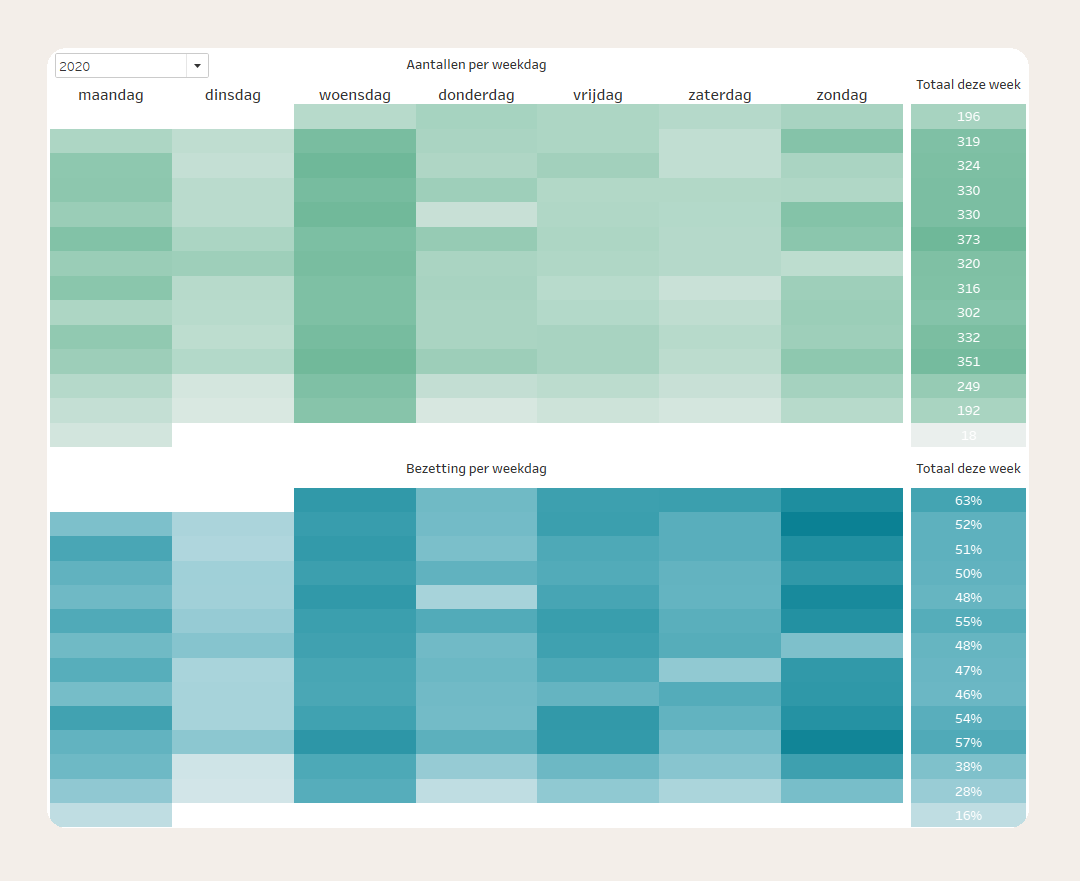
What’s the attendance?
Category
Information visualization, Small DataAbout This Project
For a small business, I created a visualization of the attendance for the available activities.
This client organizes classes every day of the week. The question was how busy these classes are.
I created a heatmap showing both the number of students per class and the occupancy relative to the maximum capacity.
- The color intensity indicates whether a class was busy or quiet.
- Each day of the week has its own cell, making it immediately clear which days are the busiest.
- Each week has its own row, allowing you to see fluctuations between weeks and spot any standout periods.