Intake about the question

A first meeting where we will discuss your question.

You may already have a clear idea of the information you have and the result you’re looking for. However, it’s also possible that your question isn’t entirely clear even to you yet. In both cases, during our first meeting, we will explore what your exact needs are and how I can assist you with them.

An intake is always free of charge and without obligation.

Based on our findings, we can create a step-by-step plan. I will then provide a proposal and quote for that plan, so you’ll know exactly what to expect in advance.

Sometimes it works well to work with a defined project for a fixed price.

Other times, it’s more convenient to work on an hourly basis. In that case, we can use a punch card system. You purchase a set number of hours at an agreed rate, and I’ll get started on your tasks. For each step, I will estimate the number of “punches” it will likely take, and after completing a step, I will update the balance. This way, you always have control over the costs and progress of the work.

Collecting data.

We map all the data needed for a project (preferably during the intake) and also create a plan for how we will bring together data from different sources.

If possible and desired, we can automate the data collection process. This is especially useful if you have data that is regularly changing or growing, such as business administration, ongoing research, or real-world data.

When it comes to keeping the data up-to-date, there are several options. You can manage it entirely on your own, or you can partially or fully outsource it.

My goal is for you to be able to maintain the visualization as much as possible after it’s completed. The dashboards are linked to a data source that you control. When you update that source, the dashboard will automatically update as well.

Analysis of data.

Data analysis and visualization sometimes overlap partially.

For example, there is analysis as preparation for visualization: In order to ensure that the visualization reliably provides the information you are looking for, it may be necessary to investigate more thoroughly where the data comes from and what the numbers mean. The ideal information is specific, accurate, and representative.

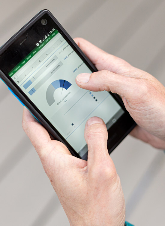
On the other hand, there is visualization for analysis: Information visualization is often a part of data analysis. The story behind the numbers becomes clearer when they are visualized. This way, you can more easily compare subgroups, discover trends, see developments over time, or identify correlations.


Statistics: For data analysis, I use descriptive and explanatory statistical methods that are relevant to your data. For data analysis, I use software such as Microsoft Excel, SPSS, and R.

Of course, there are also projects where data analysis is not necessary.

Depending on your question and needs, the data analysis step may be very extensive or almost unnecessary.

Visualizing data.

The last and usually largest step is bringing all the data to life visually.

In this phase, we meet regularly. I will provide an initial design as soon as possible, and we will proceed iteratively. This means that based on your feedback, I will take the next steps. This way, you will have a good overview of the progress and can make adjustments if necessary.

Ultimately, I can deliver the visualization in a number of different ways:

  • Online dashboard: For this, I use Tableau and the free version, Tableau Public.
  • Online applications: Perhaps you already use online software that has a built-in visualization option. Examples of software I have experience with include Exact Online, Microsoft Dynamics CRM, and Power BI.
  • Local software: I create the visualization in Excel, Power BI or Tableau Reader, and send you the file that you can open with your own local software.
  • Microsoft Applications: PowerPoint and Word.

Which applications do I use?


Dashboards

For data visualizations in interactive dashboards, I typically use the Tableau software.

Logo PowerBI 220x220

Power BI

For data visualizations in interactive dashboards, I also like using the PowerBI software.

Logo Excel 220x220

Excel

I usually merge and edit data in Excel. I use Power Query, pivot tables and charts, and I also create interactive dashboards in Excel.

Logo SPSS 220x220

SPSS

For statistical analyses I usually use SPSS.

Logo MS office 220x220

Microsoft Office

Word, Powerpoint, Access, Outlook and Teams.